Annie Li®

Annie Li®

Annie Li®

Being U Eyelash

Website Design


Luxury Lash Studio Launch Website

Being U Eyelash Studio in Queens NYC is a new studio that specializes in eyelashes for asian eyes. The studio would offer high-end services in a competitive Queens market, requiring a website that communicated luxury, expertise, and professionalism. Their goals are to establish an online presence, self service bookings, offer buyers a look into the services, and a gallery to establish trust and legitimacy. 

Universal Processing LLC (uP) is a minority-owned fintech company providing payment processing solutions to underserved communities. The previous website had a 68% bounce rate and unclear service differentiation. I led the full redesign from information architecture through visual implementation, working cross-functionally with the marketing team and development team.

Click to view website

Research & Audience

Research & Audience

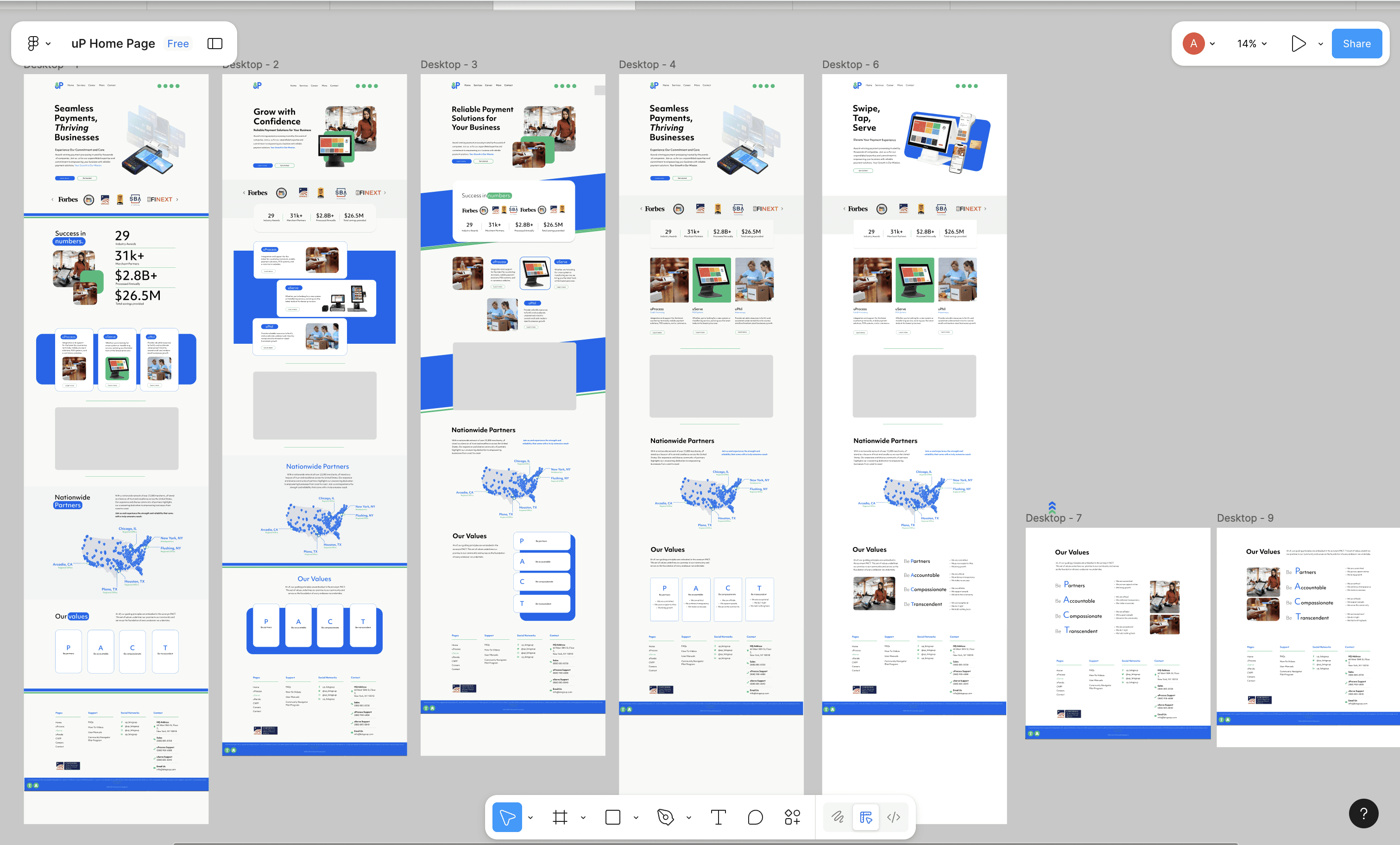
I analyzed successful fintech competitors to identify design patterns that drive engagement:

Common success factors:
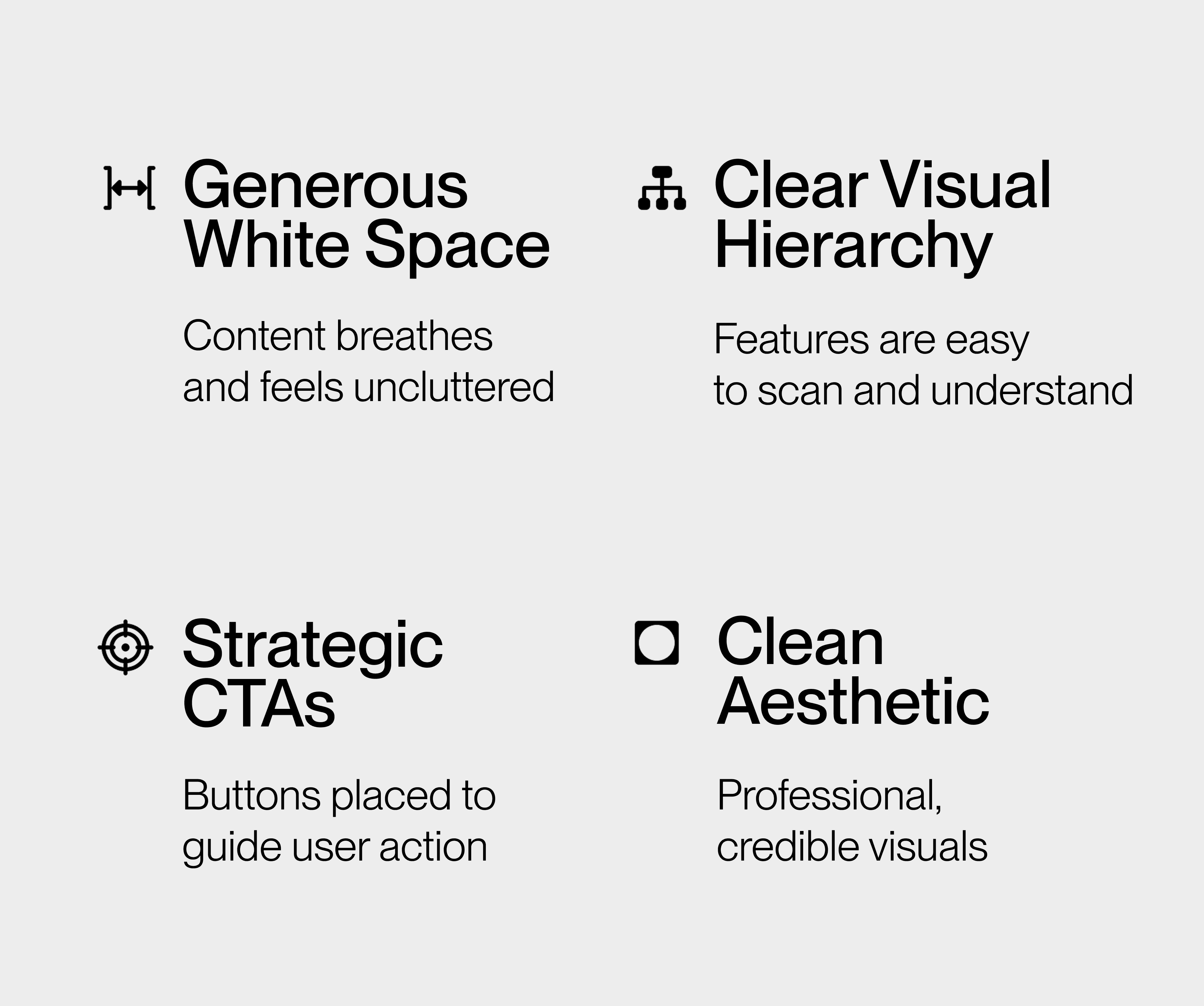
Critical Insight : Our audience wasn't Gen-Z consumers but conservative business people who needed professional, easy-to-navigate design. This shaped every design decision—prioritizing clarity, trust-building, and safety over trendy aesthetics.

Critical Insight :
Our audience wasn't Gen-Z consumers but conservative business people who needed professional, easy-to-navigate design. This shaped every design decision—prioritizing clarity, trust-building, and safety over trendy aesthetics.

Design Approach

Brand & Visual Identity


Brand &
Visual Identity


I shifted the primary color from the previous blue to clean white backgrounds, using bold accent colors
(reflecting the new brand guidelines) for buttons and CTAs. Typography changed to Objective—a modern, highly readable font that performs well with large text blocks.

I shifted the primary color from the previous blue to clean white backgrounds, using bold accent colors (reflecting the new brand guidelines) for buttons and CTAs. Typography changed to Objective—a modern, highly readable font that performs well with large text blocks.

I shifted the primary color from the previous blue to clean white backgrounds, using bold accent colors (reflecting the new brand guidelines) for buttons and CTAs. Typography changed to Objective—a modern, highly readable font that performs well with large text blocks.

Strategic CTAs

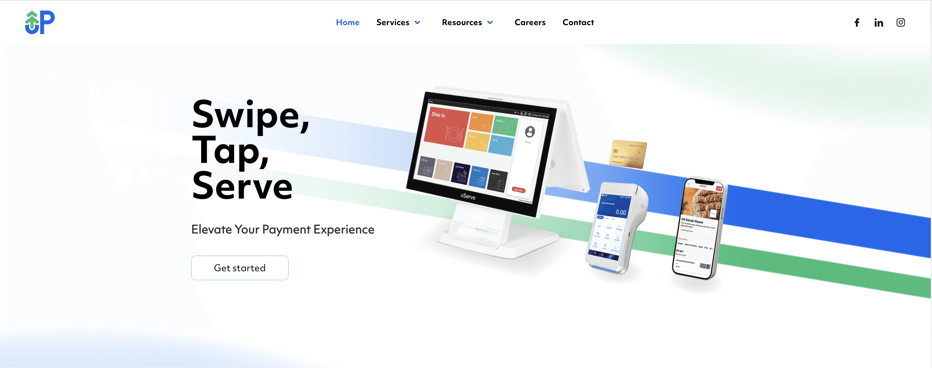
Unlike the previous site, I placed multiple calls-to-action throughout each page, making it easy for merchants to take next steps at any point in their journey.

Information Architecture

Information
Architecture

I restructured the homepage to tell a strategic story instead of overwhelming details of services.
Each section answers a critical question merchants have and guides users through a complete
decision journey:

1. "What is this company" — Awareness: Immediate product overview

I restructured the homepage to tell a strategic story instead of overwhelming details of services. Each section answers a critical question merchants have and guides users through a complete decision journey:

1. "What is this company" — Awareness: Immediate product overview

I restructured the homepage to tell a strategic story instead of overwhelming details of services. Each section answers a critical question merchants have and guides users through a complete
decision journey:

1. "What is this company" — Awareness: Immediate product overview

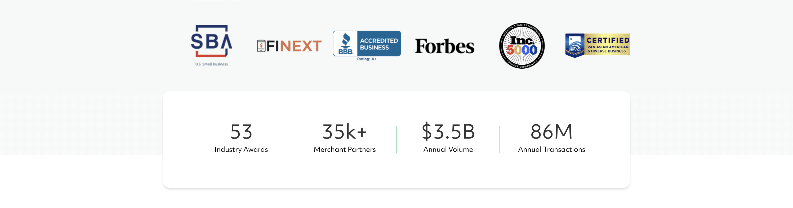
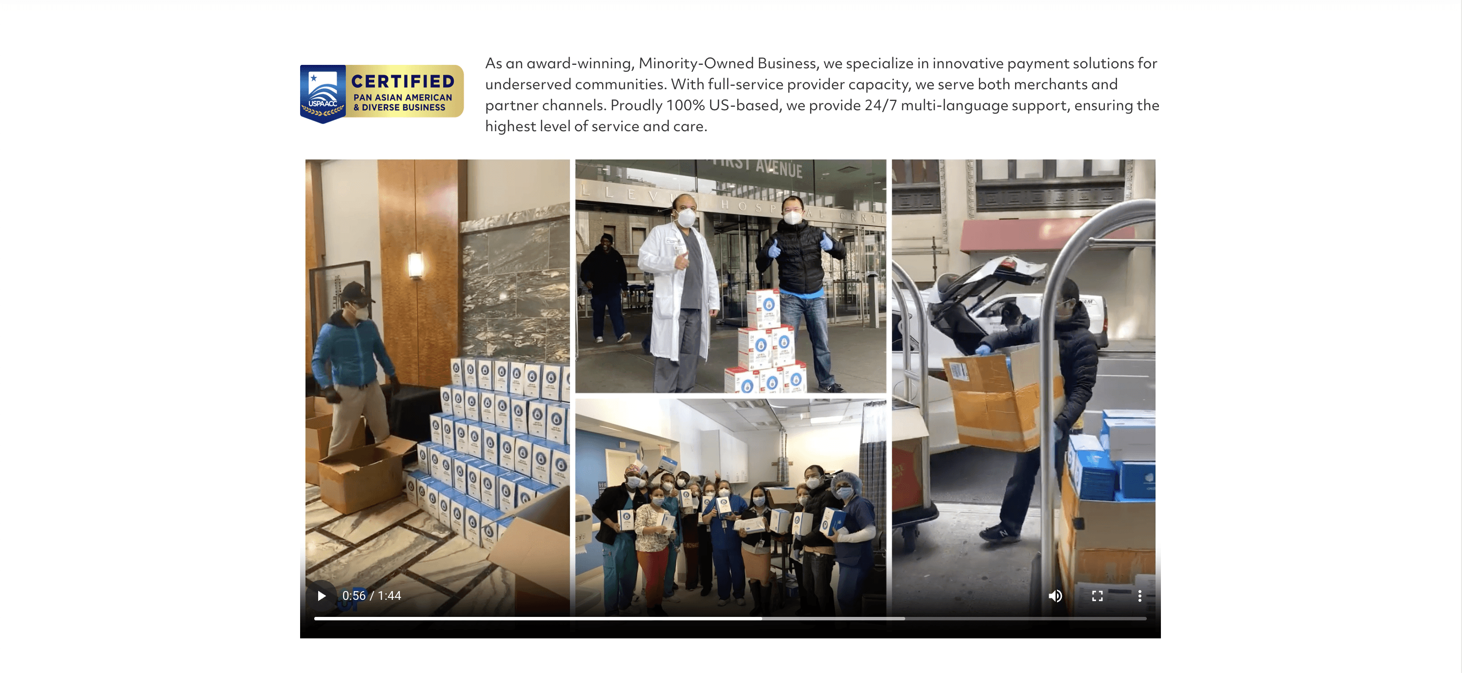
2. "Can I trust you?" — Credibility: Awards and impressive stats (35k merchants, $3.5B volume)

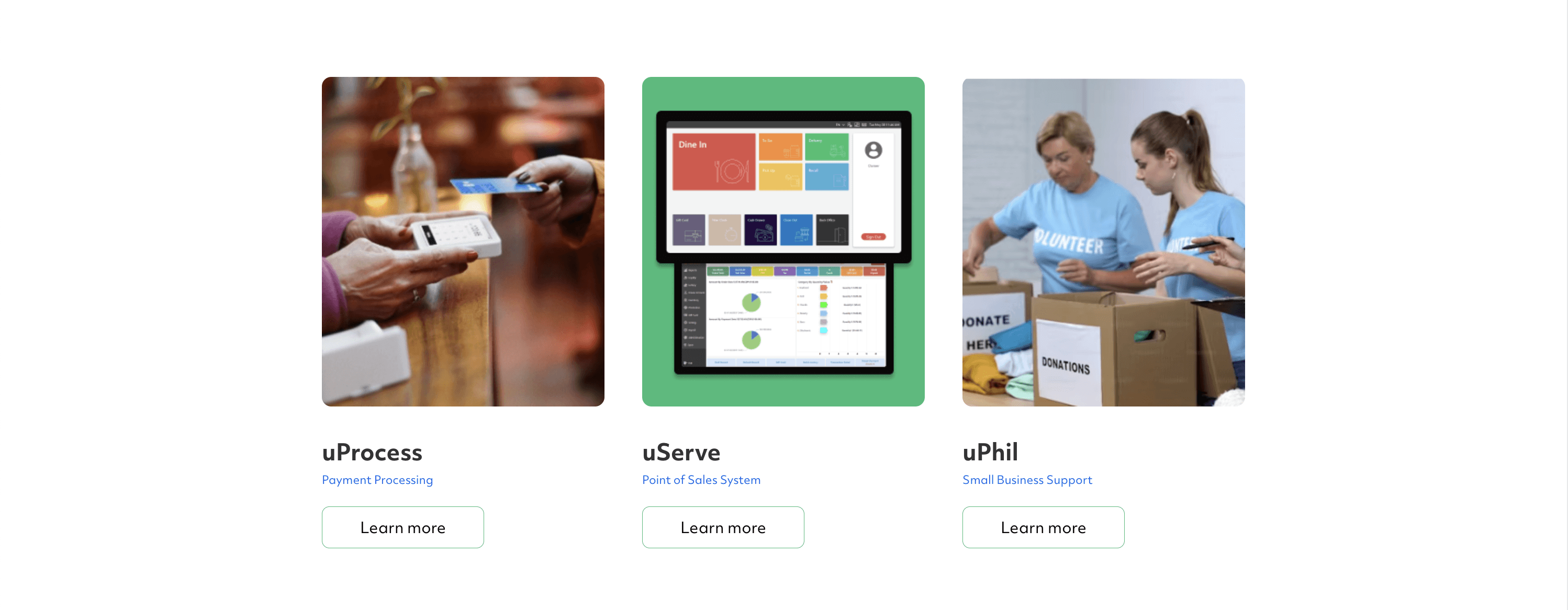
3. "What do you offer?" — Services: Clear breakdown of uProcess, uServe, uPhil

4. "Who are you?" — Company video: Building personal connection and brand story

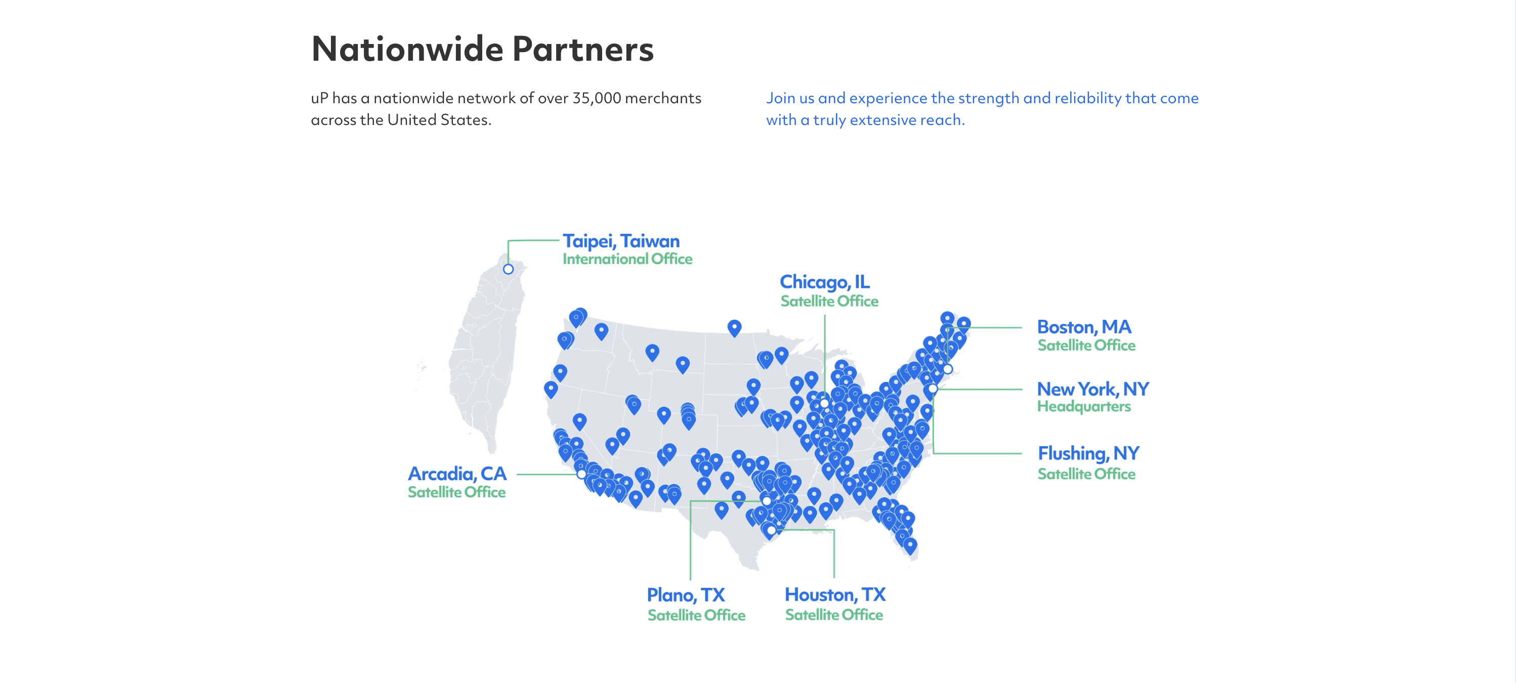
  1. "Are you available in my area?" — Nationwide Partners: Map visualization showing

    50-state coverage and local support

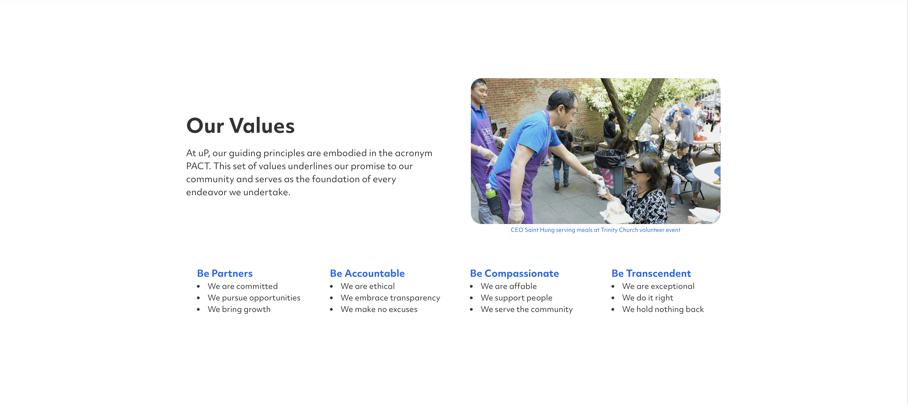
6. "Do our values align?" — PACT

This flow guides viewers from awareness → trust → understanding → action.

Design Process + Explorations

Critical Insight : I explored multiple layout approaches to find the optimal balance between showcasing services, building credibility, and guiding users to action. Early iterations focused heavily on statistics and blue backgrounds, but testing revealed this felt overwhelming. Through refinement, I moved toward cleaner white space, strategic use of brand colors, and a more logical information flow.

Results + Impact

The redesigned website transformed uP's digital presence from an outdated, information-dense platform that overwhelmed visitors into a clean, approachable experience that's easy to read, understand, and navigate. The shift from cluttered layouts and muted colors to generous white space, clear visual hierarchy, and content organization changed how merchants interact with the site. This redesign is valuable at trade shows, where attendees can now quickly grasp what uP offers, understand the distinctions between uProcess, uServe, and uPhil.

Reflection :

This project reinforced that effective design starts with understanding your audience, not following trends. Our conservative business users needed clarity over flashy aesthetics—a lesson that shaped every design decision. Working directly with uP's CEO taught me to balance business goals with user needs through collaboration and iteration. If I could revisit this, I'd conduct merchant testing at trade shows before launch to validate navigation with real users. This experience proved that strong design connects visual execution to business impact.